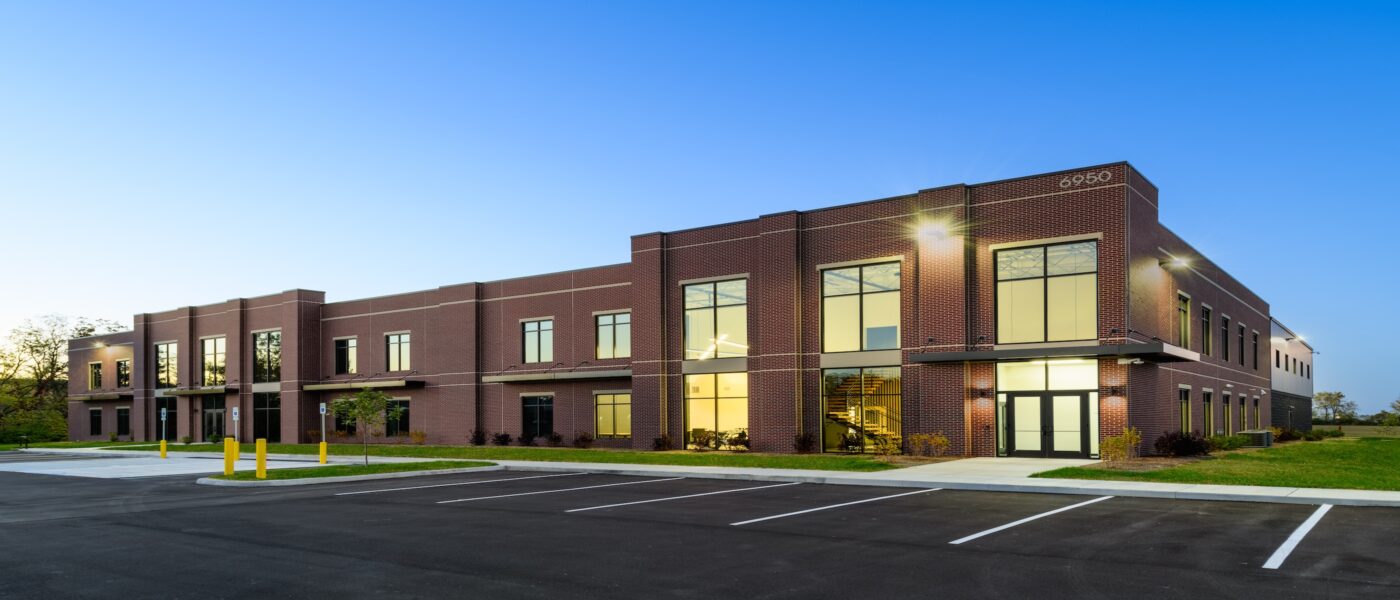
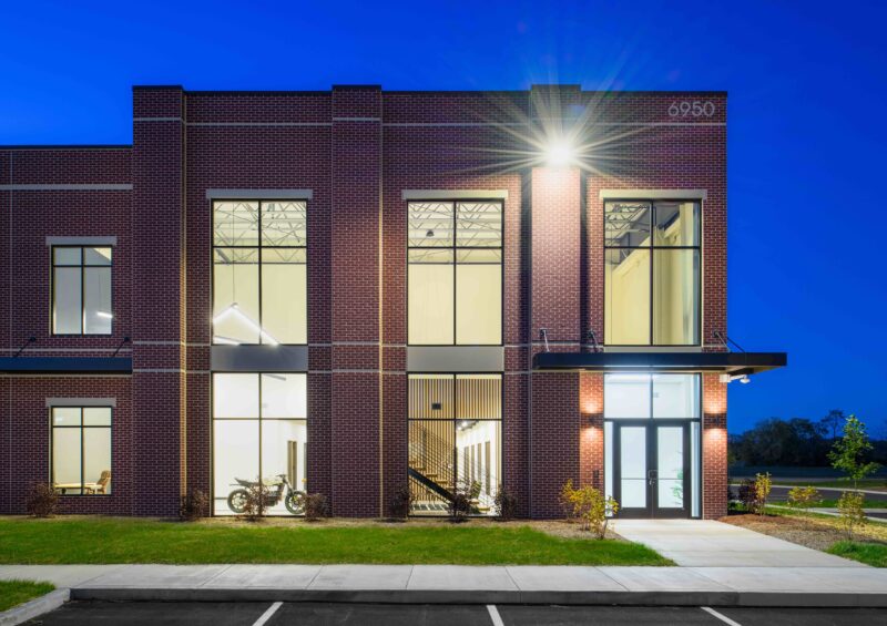
Patch Development had an idea of how they wanted their new corporate headquarters to look. There was a building in Fishers they liked, a precast one with a brick liner panel. Its look and vibe had been inspired by yet another building, one in southern Indiana. When Patch learned that Curran had designed both projects, and that partner Melissa Garrison had been the architect, they were eager to start on their own space.
Patch, a relatively new developer, was founded from the desire to develop quality commercial real estate with a high degree of integrity. As a younger company with plans to grow, they needed a space that could accommodate future team members. So, as Curran worked with Patch to design their new office, they made sure the overall building had plenty of room for their client, as well as tenants.
“We were super excited to help them build out their own office space,” says Melissa. “Their vision and their desires aligned with our vision and what we saw for the project.”
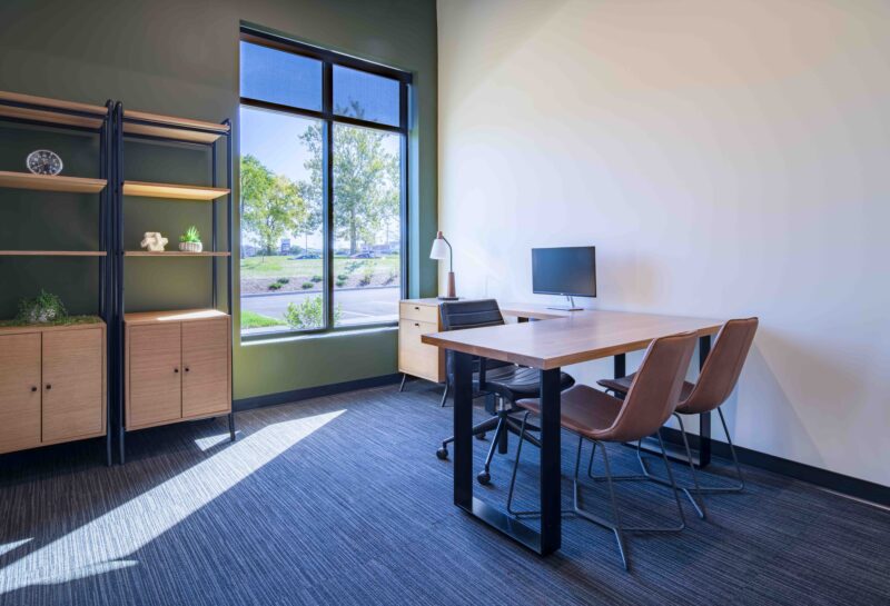
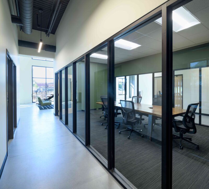
Overall, the building in which Patch is located is about 30,000 square feet. (Most of the square footage is devoted to tenants, who can build out and personalize their own space.) Patch’s office is approximately 3,300 square feet and includes seven private offices, an open office area, and two conference rooms located along the space’s central spine. The “formal” conference room, painted a rich green, can seat 10-12 people, while the smaller conference room features comfortable armchairs and deep blue walls for a more lounge-like feel. With their striking paint colors, the conference rooms feel like “jewel boxes” nestled in the middle of the action.
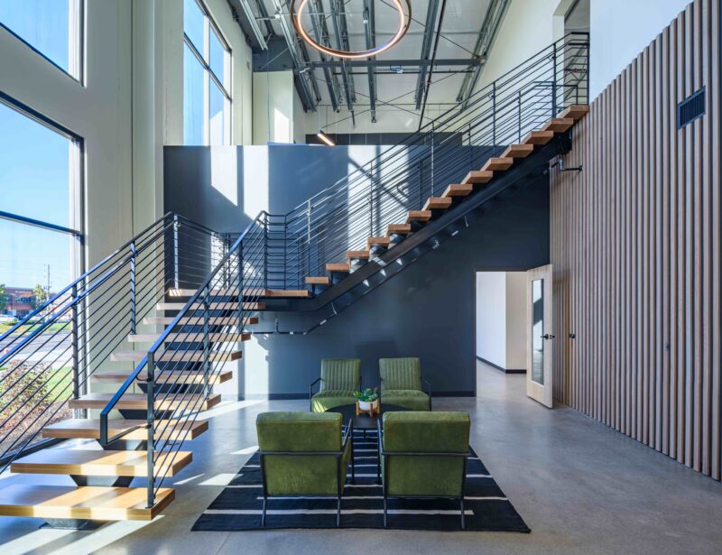
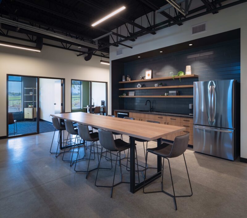
The lobby space and breakroom are also worth mentioning. The lobby capitalizes on the building’s height and includes a large, open-tread staircase. Large windows along the front façade bring in a lot of natural light. The space also includes a deliberately unfinished mezzanine. While currently used as a storage area, the mezzanine can be transformed into office space in the future. The breakroom is similarly open and welcoming.
“They wanted a spot where everyone could congregate,” said Melissa. “There’s a glass garage door that separates the breakroom from where they’re planning to put in a pickleball court. It’s an inviting space where people can hang out.”
Because Patch’s new building was a pre-engineered metal building, the project did come with a few challenges. For example, a pre-engineered metal building features a ridged frame and column layout. That meant Melissa and the rest of the design team had to work around the columns and incorporate them into the design.
Overall, it was a smooth process, and we’re grateful to have such a great relationship with Patch. As Melissa said, “It’s a very friendship-driven relationship. We understand them and they understand us.”
